top of page


Reinventing Jam
The Yummy Spread Co.
Visual Identity
Packaging Design
Brand Positioning
Art Direction
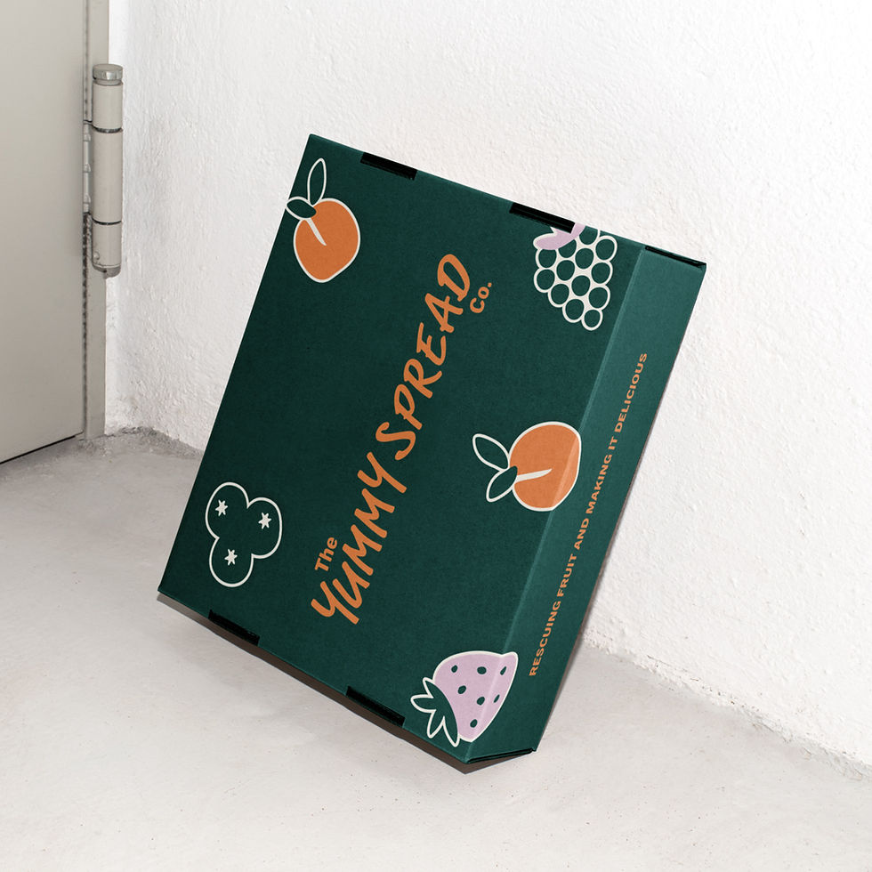
The Yummy Spread Co are a sustainable food brand on a mission to tackle food waste. They work collaboratively with fruit farmers, purchasing fruit that is considered 'too ugly' for retail sales, but perfectly good enough for making delicious jams! The brand was seeking a full visual identity, including packaging design, celebrating the core brand mission of tackling food waste head on.



The Insight
Despite being a household staple, the preserves category has remained visually stagnant for years - dominated by heritage cues. While this communicates familiarity, it leaves little room for excitement or emotional connection, especially for younger consumers. Adjacent categories like nut butters have evolved rapidly, embracing bold branding, playful storytelling and clear mission-led messaging. This created an opportunity to disrupt a tired category with a fresh, energetic brand that champions rescued fruit, injects personality back into spreads, and reframes jam as something vibrant, modern and culturally relevant.
The Direction
The visual identity celebrates the beauty in imperfection. Rather than hiding the idea of 'ugly fruit', the brand leans into it with bold shapes, expressive typography and a playful tone of voice. The identity amplifies the brand’s mission in an uplifting, vibrant way, positioning rescued fruit as something exciting, not compromised. The result is a visually energetic world that stands out in the sustainable food space - proving that tackling waste can be fun, flavourful and full of character.


Colour Palette System
The colour palette balances confidence with creativity. Grounded by Deep Green and softened by Blank Canvas, vibrant accents of Punchy Orange and Soft Lilac bring warmth, energy and personality, creating a distinctive and contemporary look and feel.


Beyond the Jar
Designed with versatility in mind, the identity scales confidently from packaging to large-format applications. Oversized fruit illustrations, vibrant colours and bold typography create eye-catching moments that reinforce the brand's fun, fresh and approachable character.


Let's Work Together
elliekingcreative@gmail.com
@ek_creative_
© 2026 by EK Creative.
bottom of page